In Google, Mobile, Technology
Testing how responsive sites render on multiple devices can be time consuming and problematic but a recent discovery by the Simpleview team is a real game changer, both for us and our clients!
When we develop sites to 7 or more responsive break points, our clients often help out with testing by viewing their site on their own phone and range of devices (tablets, desktops etc) at home.
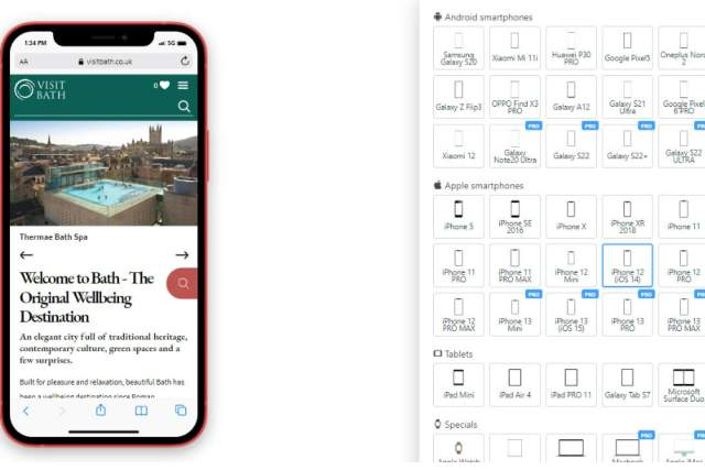
The Google Chrome Mobile Simulator tool means that you can view your website as if you were viewing it on tablet, mobile and even watches once it has been enabled on your Chrome web browser.
It’s really easy to install and comes with a whole range of useful features and functionality:
- Easy to use – one click to switch between mobile version and desktop version
- View screens in both landscape and portrait mode
- Create high-definition screenshots (PNG format) and screencasts (GIF format) if you want your site to feature in any of your marketing media
- Available for 16 models of Android smartphone and 15 models of Apple smartphones to test your site on different resolutions.
- If your mobile device isn’t included in the default list, a custom device can be added.
- The look and feel of web pages at multiple zoom levels can be tested.
To find out more, see the full list of supported devices or to install the extension, visit the Chrome Web Store.
Image courtesy of https://visitbath.co.uk/
