

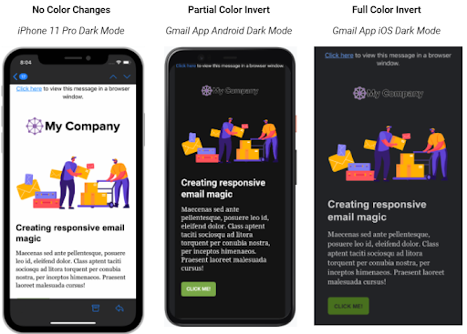
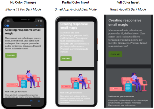
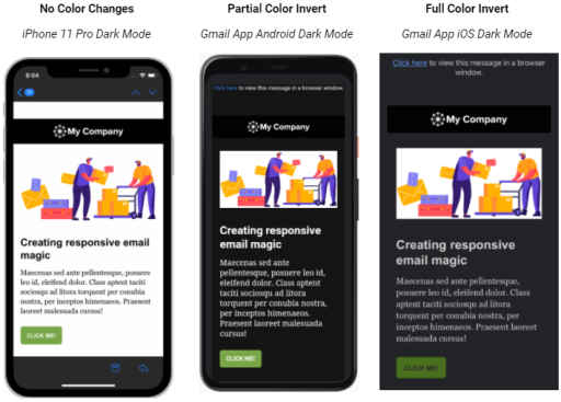
What Does Dark Mode Do to Emails?
I think everyone could agree when it comes to email … nothing is easy. This definitely includes how the various email clients display your email when in Dark Mode. With three types currently identified, let’s explore how they affect your emails:
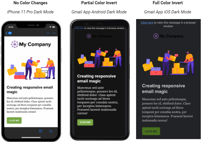
No Color Changes.
There’s no impact on how your email is rendered. The email will look exactly the same in light mode and dark mode. Supported Email Clients: Apple Mail, iPhone Mail, iPad Mail, Hey.com
Partial Color Invert.
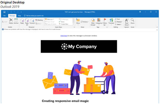
Only detects areas with light backgrounds and inverts them so the light backgrounds are dark while the dark text becomes light. The email clients will generally leave areas that already have a dark background alone, resulting in a fully dark mode design. Supported Email Clients: Outlook.com, Outlook 2019 (Mac OS), Outlook App (iOS and Android), Gmail App (Android)
Full Color Invert.
This is the most invasive color scheme. Not only inverts the areas with light backgrounds, but also impacts dark backgrounds. The light backgrounds have been converted to dark versions of the original colors. And text areas that previously had a dark background with light text are now light with dark text. Supported Email Clients: Outlook 2019 (Windows) and Gmail App (iOS)
Now let’s see how your email would look in each of these types:
Why Does This Matter?
Making sure your logo is recognizable should be a top priority, along with displaying legible text. If your recipients can’t easily read your email or recognize who it’s from, they will ignore it, delete it, or mark it as spam — all actions that will negatively impact your email deliverability.
Where Do You Start?
Not all emails look bad in Dark Mode. The easiest way to find out how yours will look is to view your email through a Partial Color Invert and a Full Color Invert email client like Outlook.com (on desktop) and Gmail on iOS. You can also use email testing platforms like Email on Acid or Litmus. You might find you don’t need to do anything at all.
What Happened to My Logo?
A ‘disappearing logo’ is the number one complaint we hear when working with clients. This ‘disappearing logo’ happens when you have a logo with white letters on a black background (the black background is inverted to white and everything blends together) or a logo with black letters on a white background (the white background is inverted to black and everything blends together). Either way, your logo is unrecognizable. What can you do?
![]()
3 Options for Updating Your Logo
1.) Make a banner. Instead of placing your logo centered at the top of your email with a background color, create that entire area as a single banner image. Traditionally, these banners are 600px x 100px (depending on the width of your email and the height of your logo).
2.) Add a background color. Adding a background color is a very common method of adding a background color to your logo that matches the background color in your email.
3.) Add a white outline. This method can be cringeworthy to your brand specialists as you add a 1px or 2px stroke to the outside of your black logo and/or text. However, it will only be visible to those viewing the logo in Dark Mode.
5 Steps to Optimize Your Emails for Dark Mode
1.) Use transparent dividers. When creating your dividers, try to avoid using a background color. Instead, make them transparent. This will ensure your email will look as intended when viewed in Dark Mode.
2.) Update social media icons. These often are dark in color and located in the footer of your email, where they can get lost when viewed in Dark Mode. From the example below, you can see the three different ways these icons can be altered — a white background, as a transparent PNG, and with the stroke around it. We recommend adding a 2px stroke.
![]()
![]()
3.) Use transparent images. The great thing about using a transparent image (one that doesn’t have a colored or white background) is it can be placed on just about any background color without having to worry about conflicts. However, you do need to be careful with images or icons that are black (see #2 above).
4.) Send a plain-text email. I wouldn’t be doing my due diligence if I didn’t mention sending plain-text emails. By default, these are black text on a white background and seamlessly transition into Dark Mode.
5.) Target Dark Mode users. If you feel comfortable digging into the CSS of your email, then adding in your own Dark Mode overrides will help you control how your email is viewed. Well, mostly. The Gmail App (iOS and Android) as well as Outlook 2019 (Windows) will ignore these styles. For detailed information, check out this Litmus article.